Twins Fertility Care, a compassionate and specialized fertility clinic, partnered with Captica to develop a meaningful and serene brand identity. The aim was to create a visual system that reflects hope, care, and the delicate beauty of life—while positioning the brand as both trustworthy and emotionally supportive in a sensitive space.
Service
Branding & Identity Desgining
Client
Twins Fertility Care
Year
2019
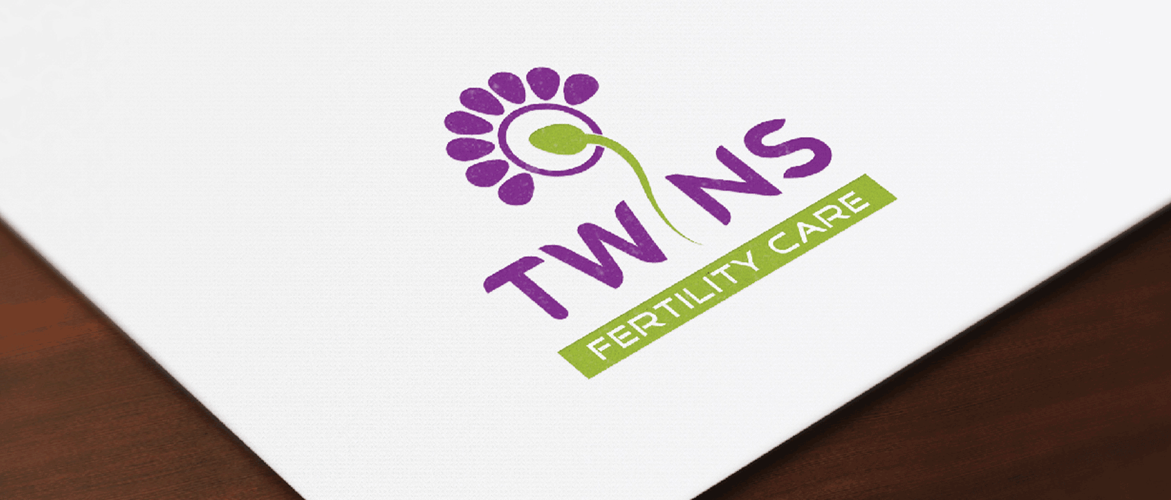
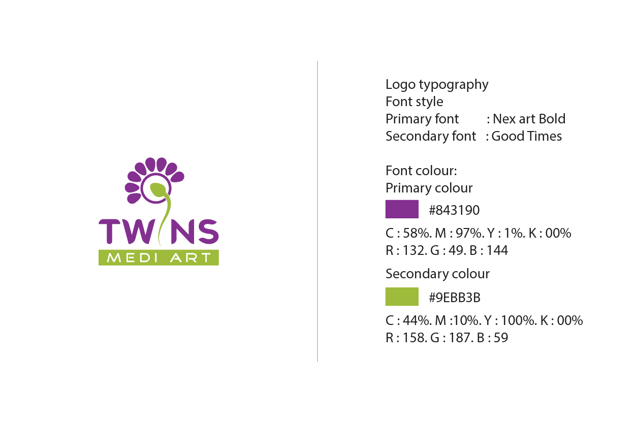
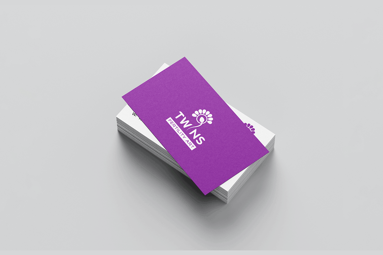
The logo concept brings together a flower symbol and the universal symbol of fertility, with a thoughtful twist to subtly depict twins—representing both the miracle of life and the clinic’s core focus. The design is clean, minimal, and creative, offering a soft yet memorable identity that evokes emotional warmth and reassurance from the very first glance.
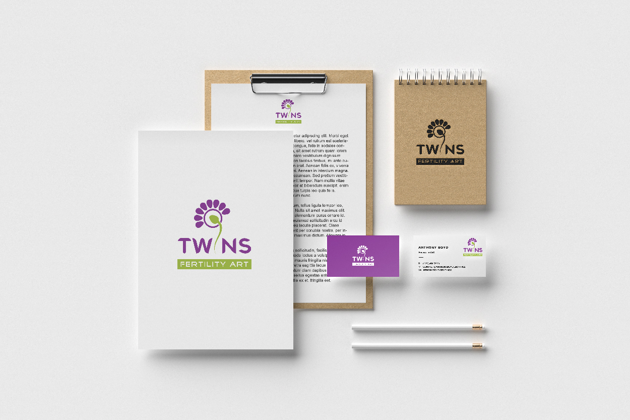
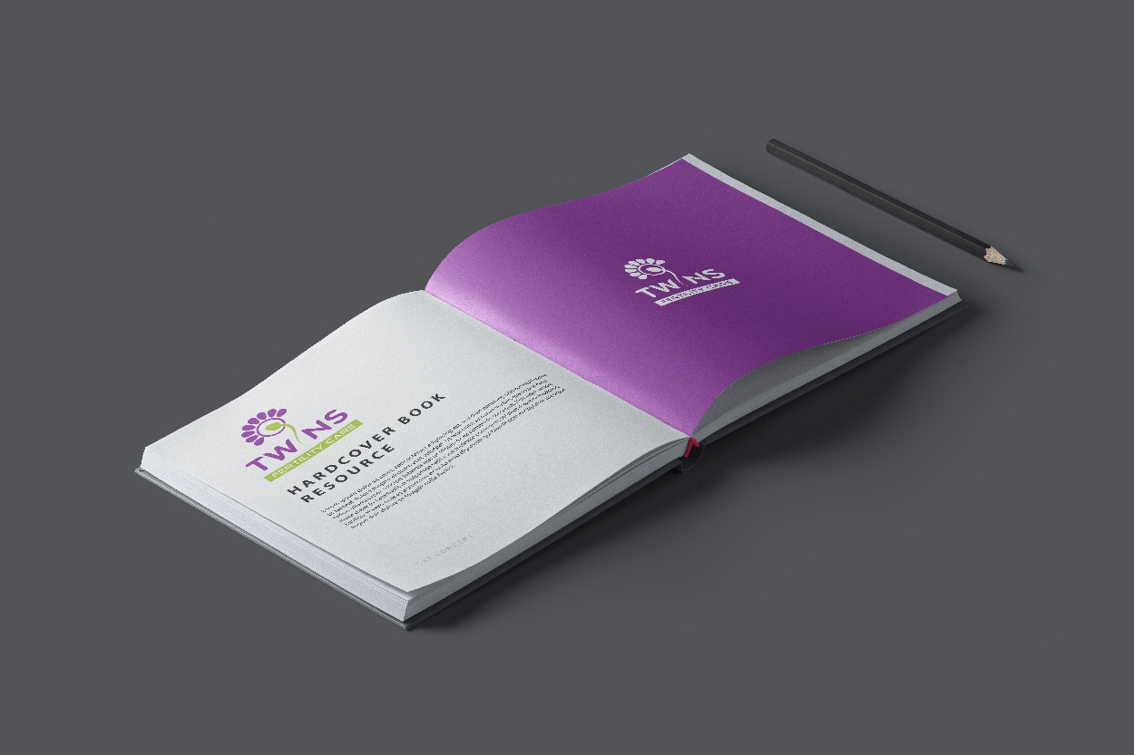
The brand identity adopts a gentle, pastel-toned palette—featuring calming shades like lavender, blush, and soft ivory—paired with elegant rounded typography. From clinic interiors and consultation forms to digital presence and patient touchpoints, every element of the branding communicates care, professionalism, and the promise of new beginnings.