Skyon, a progressive brand in the ceramic tiles and sanitaryware industry, teamed up with Captica to create a brand identity that reflects innovation, trust, and modern aesthetics. The goal was to develop a visual system that speaks directly to architects, homeowners, and contractors—communicating both elegance and functional excellence in every detail.
Service
Branding & Identity Designing
Client
Skyon Tiles
Year
2021
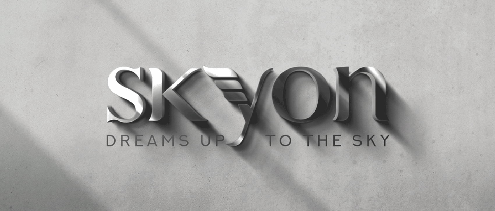
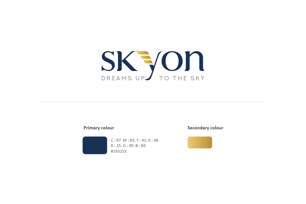
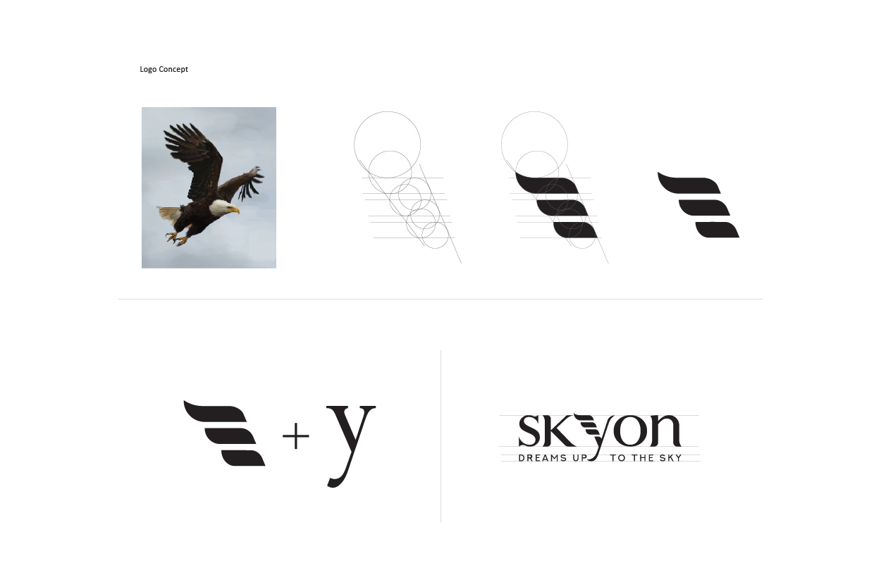
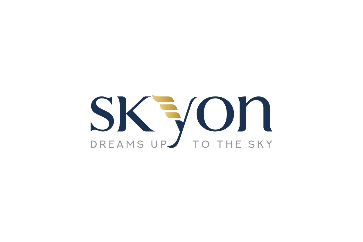
The logo features a refined and symbolic adaptation of the letter ‘Y’, shaped into wings, representing growth, vision, and limitless possibilities. At its center, a globule element symbolizes the fulfillment of customer dreams—from dream bathrooms to stunning interiors. The clean and minimal design makes the logo both memorable and versatile, fitting seamlessly across product packaging, catalogs, and showroom branding.
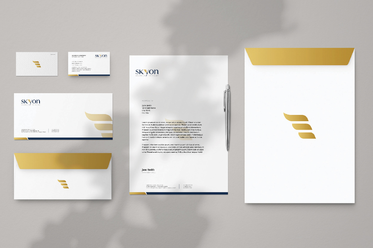
The overall identity follows a neutral yet striking palette—featuring shades of stone grey, ceramic white, and subtle metallics. Paired with modern typography and grid-based layouts, the branding reinforces Skyon’s dedication to quality, innovation, and customer-centric design—positioning it as a future-ready leader in the tiles and sanitary space.