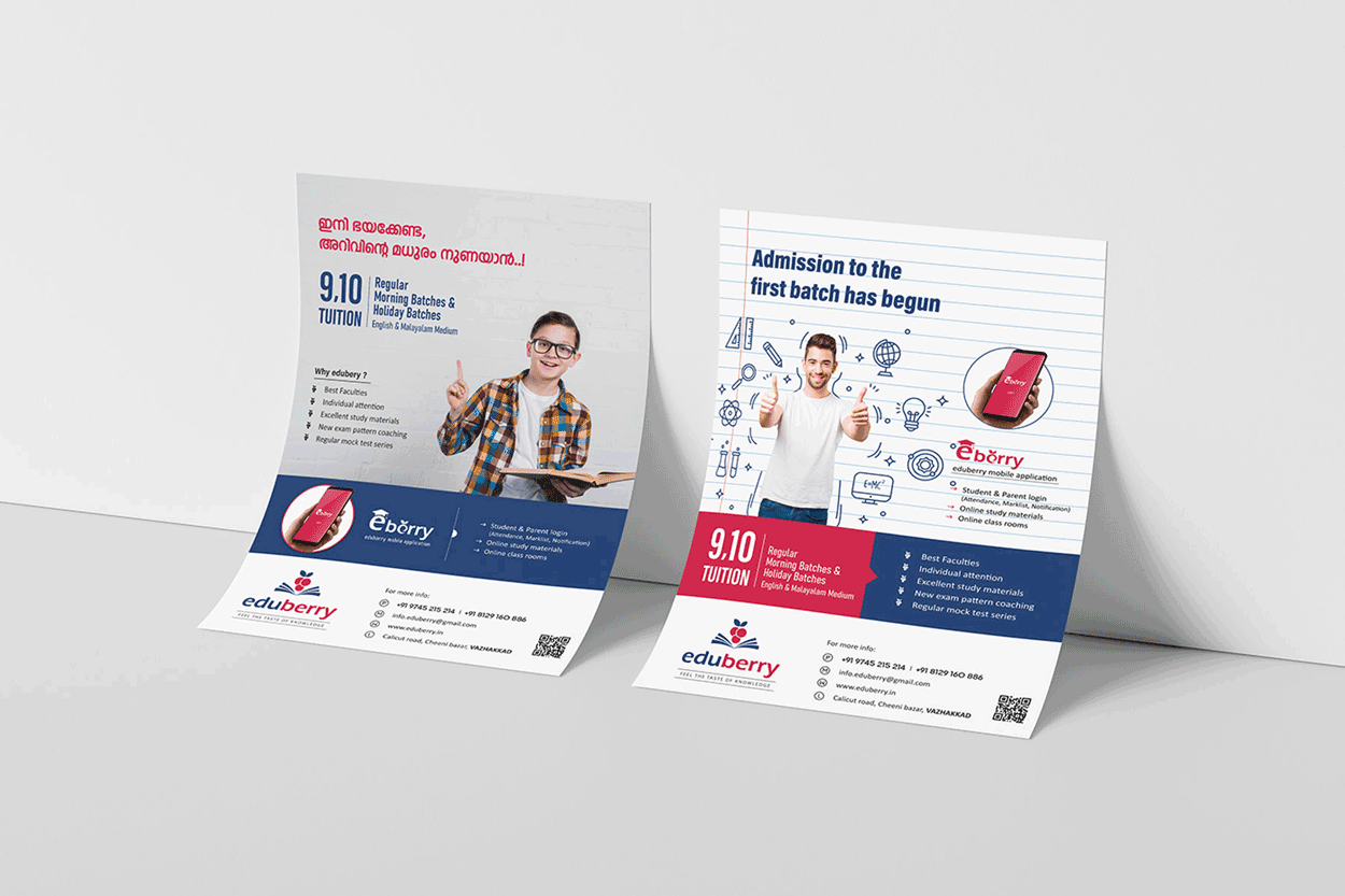
Eduberry, a vibrant and student-focused tuition center, partnered with Captica to create a brand identity that is fresh, meaningful, and engaging. The objective was to design a brand that reflects both educational excellence and a joyful, approachable learning environment—making students feel excited and confident about their academic journey.
Service
Branding & Identity Designing
Client
Eduberry
Year
2020
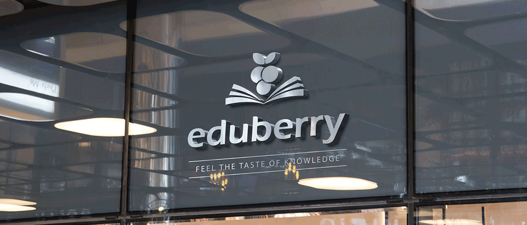
The logo concept is rooted in the unique blend of “education” and “berry”, symbolizing the sweet, enriching experience of learning. It visually represents the real taste of knowledge, with a clean and minimal design that creatively incorporates fruit-inspired elements in harmony with educational motifs. This makes the logo not just attractive and memorable but also deeply symbolic of Eduberry’s mission.
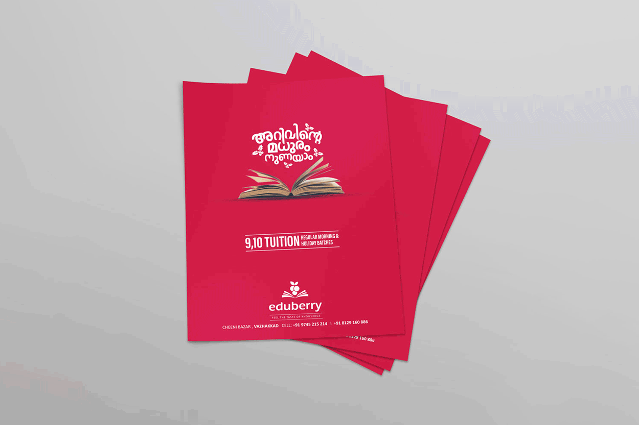
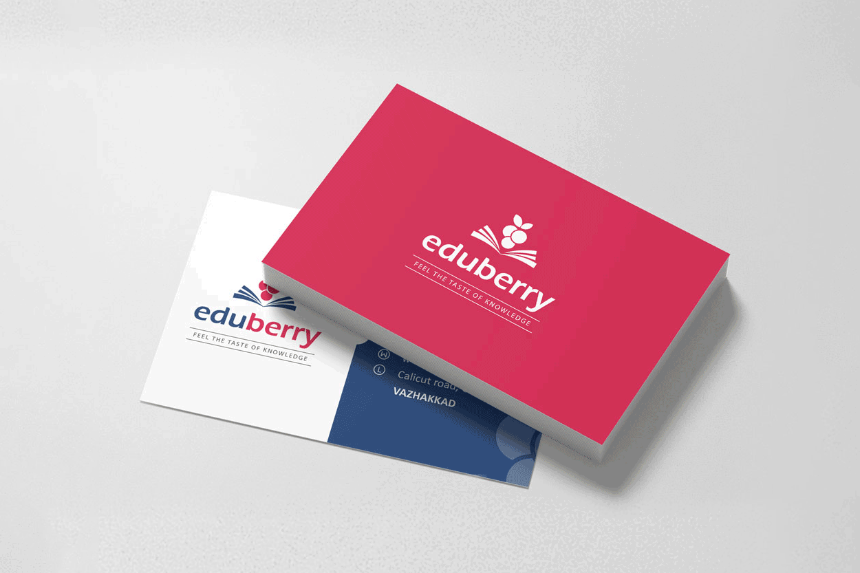
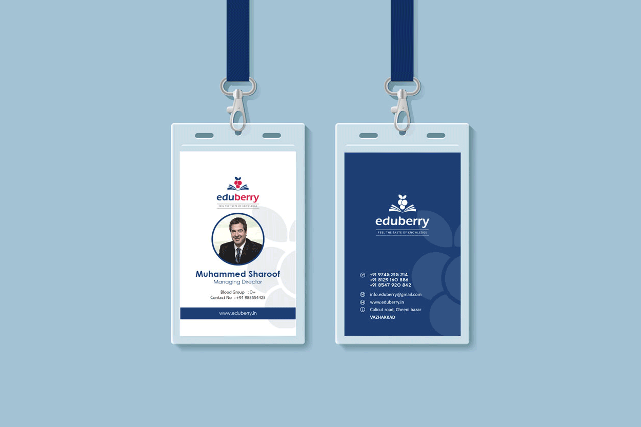
The visual identity is supported by a cheerful color palette—featuring berry tones, soft purples, and vibrant accents—paired with rounded, friendly typography to create a student-friendly and trustworthy feel. From classroom posters and notebooks to digital banners and parent communication, the branding expresses warmth, clarity, and a results-driven yet enjoyable approach to learning.