Forlingo, a dynamic foreign language academy, partnered with Captica to create a brand identity that conveys connection, learning, and global unity. The objective was to craft a logo that reflects the academy’s core philosophy: empowering communication across cultures through immersive, people-centered education.
Service
Branding & Identity Designing
Client
Forlingo
Year
2025
The logo design features a well-balanced logomark and logotype, carefully aligned in size and proportion for visual harmony. The puzzle pieces symbolize the integration of different languages and cultures, while subtle forms within the logo depict a teacher guiding engaged students—capturing the heart of Forlingo’s learning environment.
The spiraling linework represents continuous growth and the evolving relationship between educators and learners, making the design both meaningful and visually striking. A modern, approachable color palette—featuring calming blues, vibrant accents, and soft neutrals—was paired with sleek, rounded typography to emphasize accessibility, trust, and intellectual curiosity.
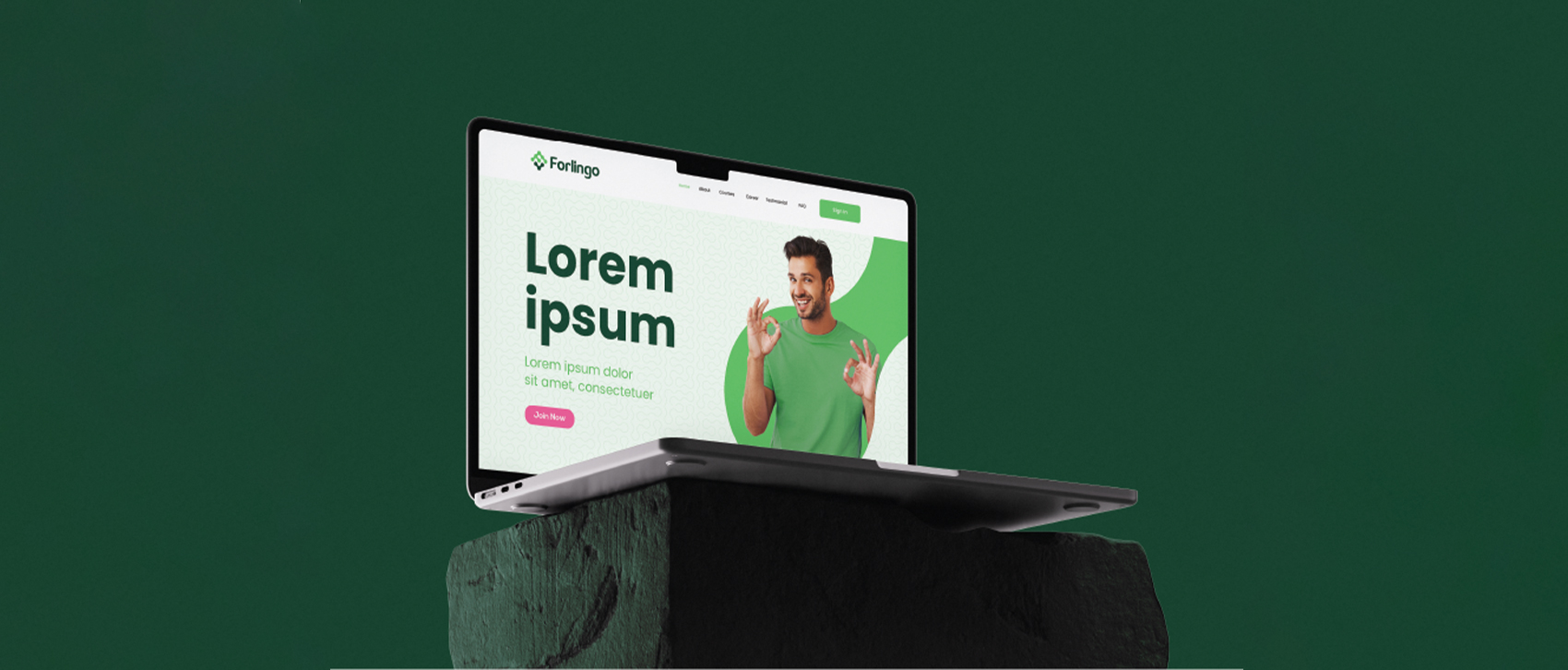
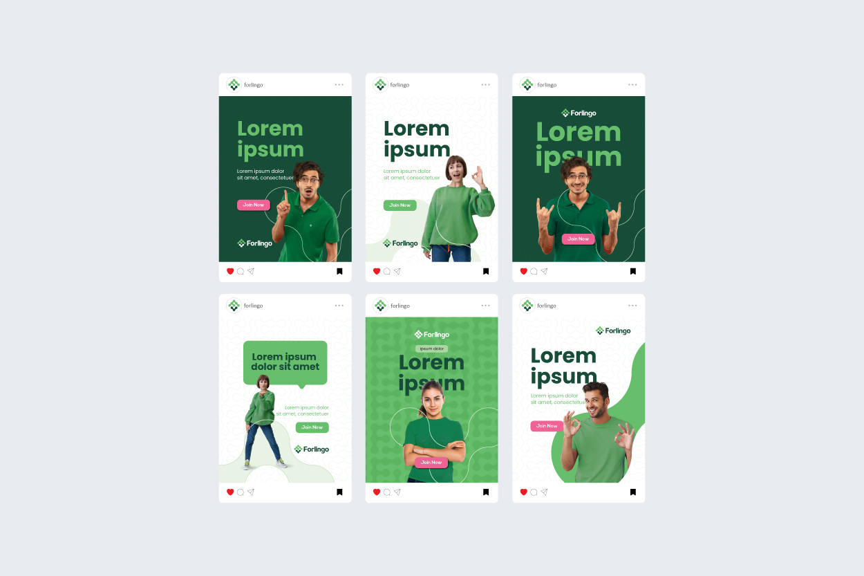
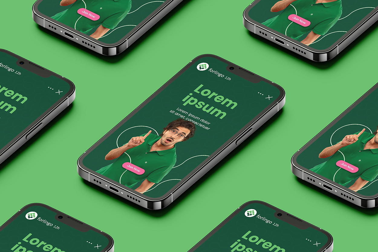
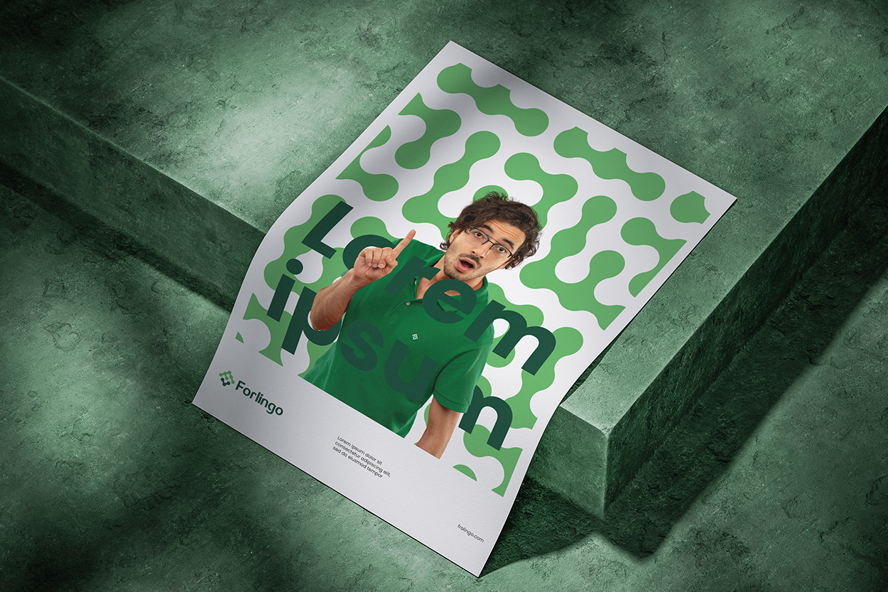
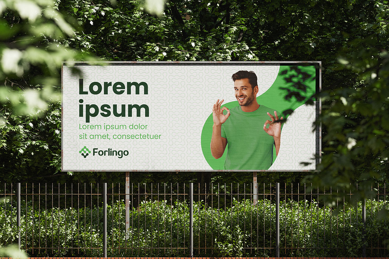
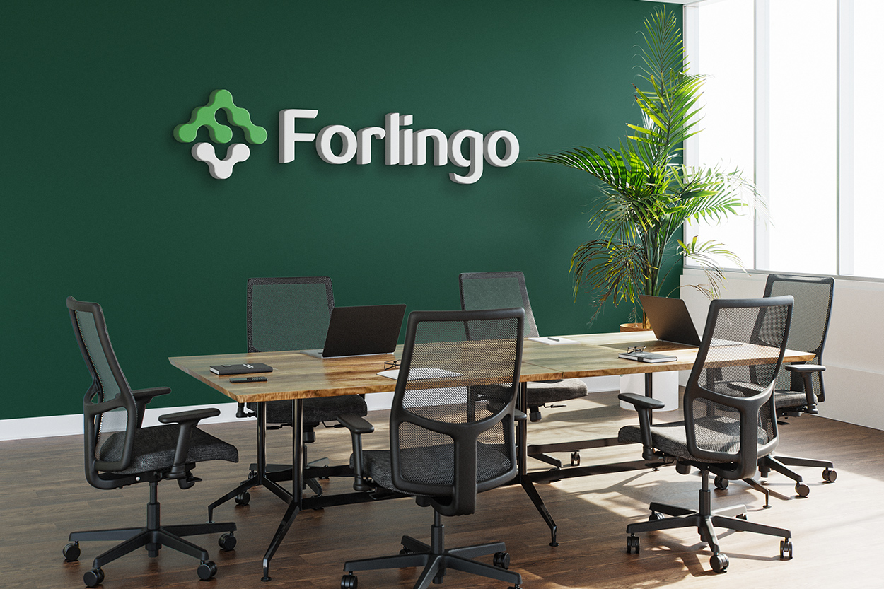
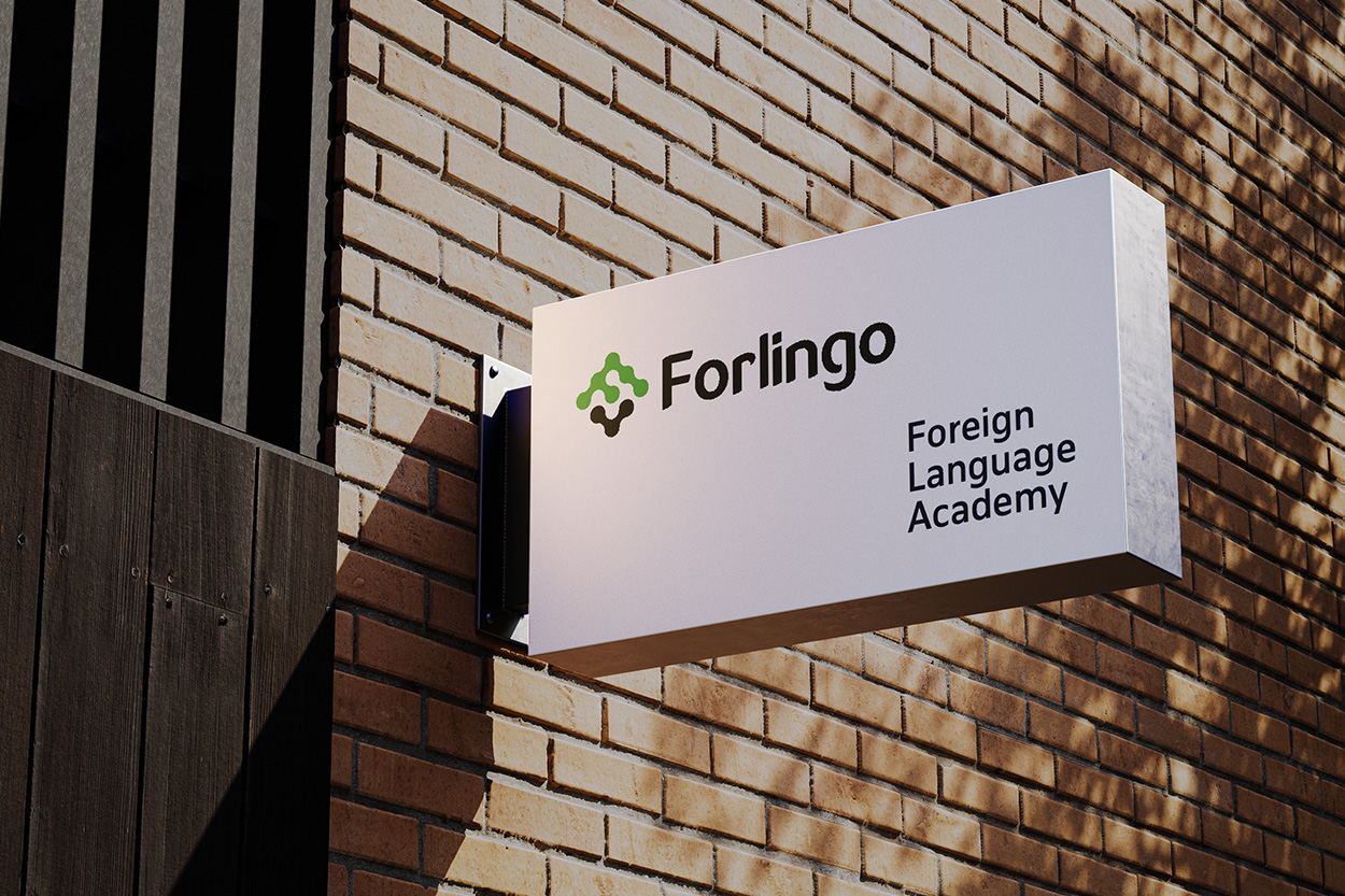
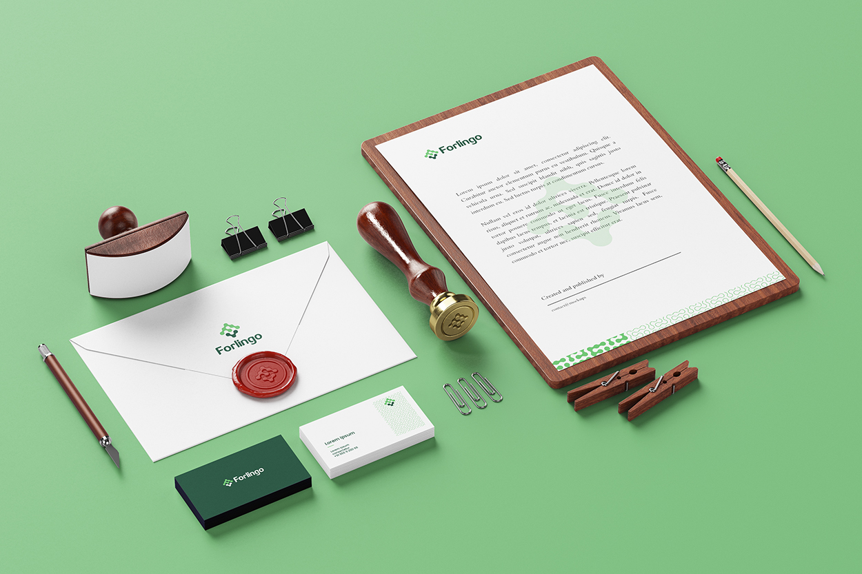
From signage and student kits to digital platforms and course materials, the branding system for Forlingo is designed to be clean, minimal, creative, and globally resonant—perfectly matching its mission to bridge cultures through language.