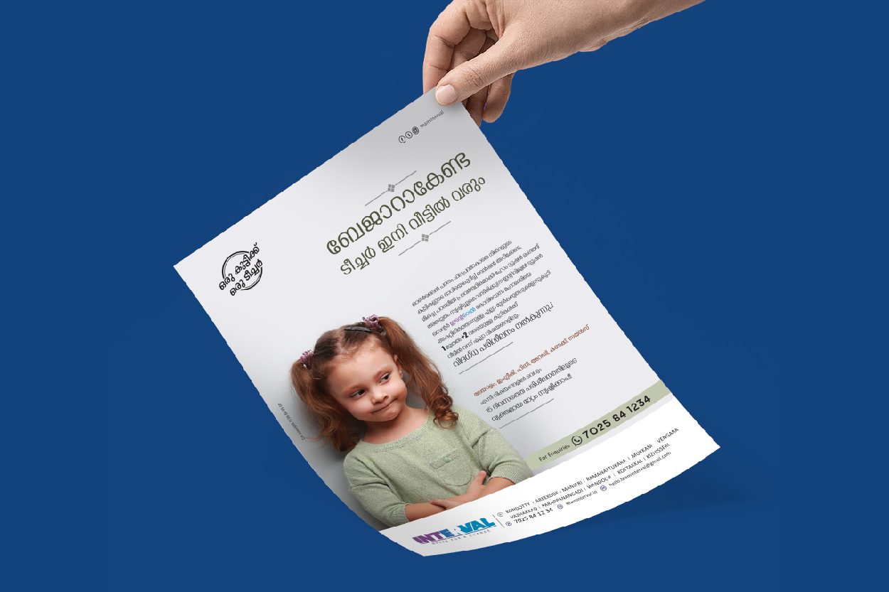
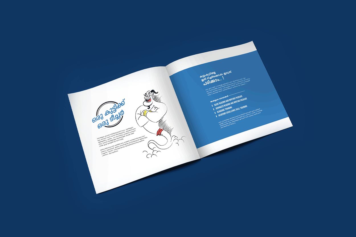
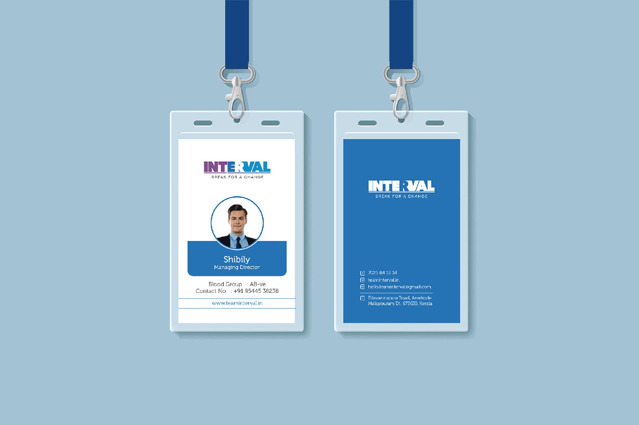
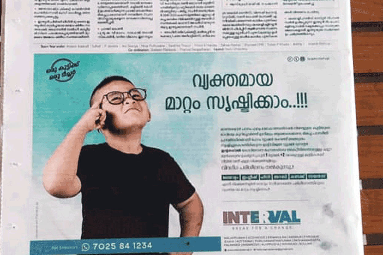
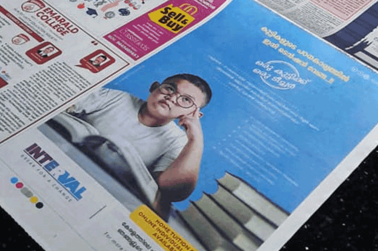
The rebranding of Interval Educational Institution focuses on highlighting its distinct one-on-one tuition methodology — a personalized learning model that assigns a dedicated teacher to each student. This “a teacher for a student” approach forms the foundation of Interval’s teaching philosophy, helping students master the basics of every subject with tailored support. Our rebranding objective was to visually communicate this deep, individualized attention while creating a sense of warmth, trust, and innovation.
Service
Branding & Packaging
Client
Keramy Coconut Products
Year
2021
To embody the guiding and transformative role of the teacher, we introduced a unique genie concept — a symbol of personalized assistance, wisdom, and limitless learning potential. The genie represents a mentor who appears just when needed, ready to adapt and respond to every student’s unique learning style. This playful yet powerful figure becomes a mascot of encouragement and magic, aligning perfectly with Interval’s mission to unlock each student’s academic potential in a fun, engaging, and personalized way.
The identity’s color combination reflects a thoughtful blend of vibrant imagination and educational clarity. We selected shades of deep purple for wisdom and creativity, balanced with soft sky blue for calm guidance, and touches of sunny yellow to spark energy and optimism. These tones bring a modern, youth-friendly vibe while maintaining professional credibility. Typography, icons, and supporting graphics carry a playful yet structured aesthetic, reinforcing the individualized support and magical learning journey every student experiences at Interval.